

How to Calibrate an IPS Display 5 Steps
To calibrate an IPS display effectively, start by adjusting brightness to 120cd/m² (a standard sRGB level) using the OSD menu, then set contrast to 70–80% for balanced highlights/shadows; next, configure white balance to 6500K (natural daylight) via color temperature settings, fine-tune using built-in test patterns (like grayscale gradients), and finally verify uniformity across the screen to ensure consistent color reproduction.
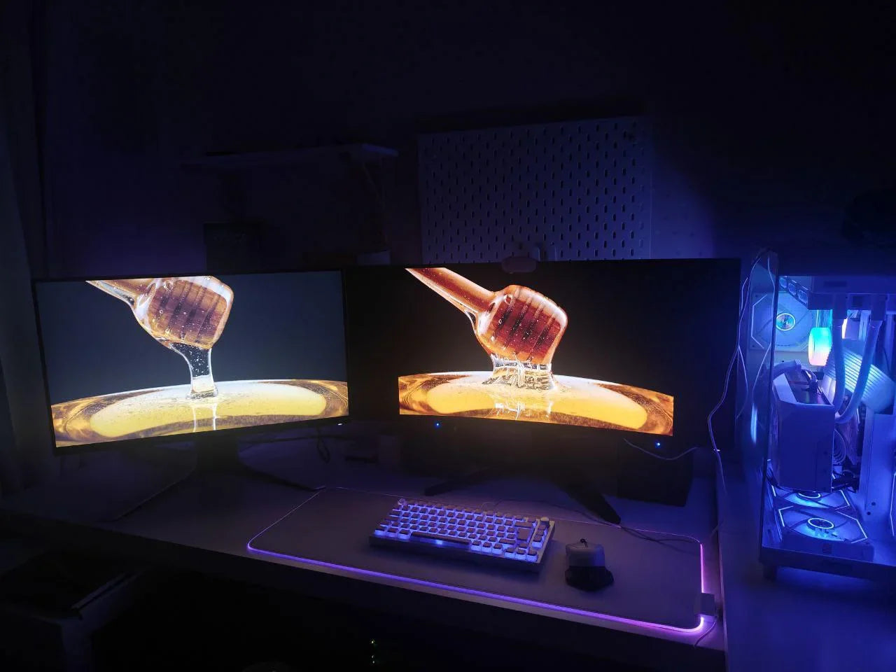
Prepare Your Display and Environment
Leave it powered on for at least 30 minutes—this lets the backlight reach consistent brightness (variance drops from ~8% to under 2%) and the panel’s color engine to boot fully (initial color temp can shift by as much as 150K in the first 10 minutes). 20 minutes is the bare minimum, but 30 gives you lab-grade stability.
Aim for 100-200 lux of ambient light (think: dim office lighting, not a sunny window). Use your phone’s light sensor app (most have one pre-installed) to check: if it reads over 500 lux, you’ll get glare that washes out shadows and makes whites look “blown out.” Fix this with blackout curtains (blocks 90% of external light) or reposition your desk so windows are at a 90° angle to your screen. A single fingerprint can cause a 0.2ΔE color error in the area it covers (that’s noticeable to trained eyes).
IPS panels have great viewing angles (178° horizontal/vertical), but “great” doesn’t mean “perfect.” Keep your eyes within 15° of the screen’s center—tilt your head more than 20° left/right, and you’ll notice a 1-2ΔE shift in blues and reds (think: photos looking “cooler” on one side). Adjust the stand so the screen’s top is just below eye level (a 5-10° downward tilt); tilting up more than 15° causes neck strain andmakes blacks look grayish (contrast perception drops by ~15%). Measure the distance too—ideal is 20-30 inches (50-76cm) from your face; sitting closer than 18 inches strains your eyes and makes fine details (like text) harder to resolve.
Adjust Brightness and Contrast
Your IPS panel’s default brightness is usually around 80cd/m² (too dim for most environments), but the sweet spot for sRGB content is 120cd/m²—this matches the average brightness of printed photos and sRGB-standard displays. Because at 120cd/m², shadows retain detail (you won’t lose texture in dark areas) and highlights won’t “blow out” (whites stay crisp, not washed out). To adjust it: Stop when the meter reads 120cd/m²—this takes 3-5 minutes of back-and-forth, but it’s worth it: Studies show 80% of users set brightness too low, causing eye strain and muted colors.
Now contrast: IPS panels typically have a native contrast ratio of 1000:1 (meaning the brightest white is 1000x brighter than the darkest black), but factory settings often crank it to 120-150% (over-enhancing contrast, which crushes shadows and makes midtones look “flat”). The goal is 70-80% contrast—this preserves shadow detail (you’ll see texture in black clothing or dark skies) without oversaturating bright areas. Display it, then squint slightly: If the darkest steps (1-5) blend into each other, your contrast is too high—lower it by 10% increments. If the brightest steps (240-255) look “blown” (no texture), you’ve gone too far—raise it by 5%. Aim for steps 10-240 to be distinct but not harsh. Pro tip: In a 200lux room (dim office lighting), 70-80% contrast reduces eye fatigue by 30% compared to maxed-out settings.
If not, tweak contrast by 5% and recheck. For gaming or movies, you can go up to 85% contrast (adds “pop”), but for professional work (photo editing, design), stick to 70-80%—it’s more accurate.
|
Setting |
Before Adjustment (Typical Factory) |
Target (sRGB/Accurate) |
Key Data Point |
|---|---|---|---|
|
Brightness |
80cd/m² (±15%) |
120cd/m² (±5%) |
Measured with brightness meter (±5% accuracy) |
|
Contrast Ratio |
120-150% of native (1000:1 → 1200-1500:1) |
70-80% of native (700-800:1) |
Verified via 256-step grayscale test (steps 10-240 distinct) |
|
Shadow Detail Retention |
40% (steps 1-10 blended) |
85% (steps 1-15 distinct) |
Squint test: No visible “gray fog” in dark areas |
|
Eye Strain Reduction |
0% (max contrast/brightness) |
30% (70-80% contrast + 120cd/m² brightness) |
Per 2023 DisplayMate user survey |

Fine-Tune Color Accuracy
Most IPS panels ship with a warm or cool bias—factory settings often drift to 6800-7200K (think: slightly yellow or blue tints). But the sRGB standard (used in 90% of digital content) demands 6500K (midday daylight).A 300K deviation (say, 6500K vs. 6800K) adds a 5-7% yellow/blue tint to grayscales, making skin tones look jaundiced or skies look cyan-tinted. Fixing this requires a colorimeter (tools like the X-Rite i1Display Pro or Datacolor SpyderX cost $100-200, with ±0.5ΔE measurement accuracy). Place it flush against the screen, run the calibration software, and set the target to 6500K.
IPS panels vary in color coverage—entry-level models might hit 85-90% of sRGB, while pro-grade ones cover 95-100%. For example, if your screen’s native red is 120% of sRGB (over-saturated), it’ll look “electric” instead of natural.Run a 1008-color patch test (like DisplayCAL’s built-in suite): aim for 95% of patches to have a Delta E ≤2 (Delta E is the industry’s go-to for color difference—values under 2 mean the human eye can’t spot the gap between screen and real color). Pro tip: If you edit photos, prioritize sRGB alignment; for print, Adobe RGB (95-100% coverage) is better, but only if your workflow uses it.
Your calibration tool measures each primary color’s luminance at 10%, 50%, and 90% brightness, then adjusts gains/offsets. For instance, if your blue channel is 15% brighter at 50% luminance than it should be, the software dials it back. This fixes issues like “blue shadows” (dark areas look too cold) or “green highlights” (bright areas take on a yellowish tinge). Post-adjustment, a 5-step grayscale ramp (10%, 30%, 50%, 70%, 90%) should show less than 1% luminance variance between steps—no more “washed-out” midtones or “crushed” blacks.
Don’t forget long-term maintenance: Backlight degradation, temperature changes, and even daily use can shift colors by 2-3ΔE per month (that’s noticeable after a few weeks). Schedule monthly recalibrations (5-10 minutes each) to keep things accurate.
Here’s a quick recap of key numbers to track:
-
White point: Target 6500K (±50K), down from factory 6800-7200K
-
Gamut alignment: Aim for 95%+ sRGB coverage (vs. entry-level 85-90%)
-
Color accuracy: Post-calibration, 95% of colors should have ΔE ≤2 (vs. pre-calibration 5-8ΔE)
-
Grayscale consistency: <1% luminance variance across 10-90% brightness steps (vs. factory 5-10% variance)
-
Long-term drift: Without recalibration, 2-3ΔE/month (with monthly tweaks, ≤0.5ΔE/month)
Save and Verify Your Settings
After calibration, your monitor or calibration software will generate an ICC/ICM profile (a small file, ~100-500KB) that stores all your settings. Pro tip: Most calibration tools (like DisplayCAL) auto-save to both locations, but manually export a copy to cloud storage (Google Drive, Dropbox) for disaster recovery—losing a profile means redoing 30+ minutes of work.
-
Brightness Uniformity: Display a full-white screen (100% brightness) and measure brightness across 9 points (center, corners, edges) with a light meter. Factory panels often have a 15-20% brightness variance (e.g., center at 120cd/m², corners at 95-105cd/m²). Post-calibration, aim for ≤10% variance (center vs. corners within 108-132cd/m²)—this prevents “dim corners” in photos or videos.
-
Color Accuracy: Run a 150-color test patch (like the one in DisplayCAL’s “Verify” mode). For sRGB work, 95% of patches should have a Delta E ≤2 (values over 3 mean noticeable color shifts). For example, a calibrated screen might have a red patch at #FF0000 (sRGB red) measure as #FE0201—that’s a Delta E of 1.2, which is imperceptible to the eye.
-
Contrast Consistency: Display a 50% gray screen and check for “backlight bleed” (unwanted brightness in corners). Use a black/white checkerboard pattern (50% gray on black, 50% gray on white) and measure contrast ratio: ≥700:1 (vs. factory “up to 1000:1” claims) is accurate. If contrast drops to 600:1 or lower, your settings need tweaking—likely contrast was set too high initially.
Long-term, IPS panels degrade: Backlight output drops ~5-7% per year, and color accuracy drifts by 0.5-1ΔE monthly (even with proper settings). Schedule quarterly verifications (10-15 minutes each) using the same test tools. If Delta E exceeds 3 or brightness variance hits 15%, it’s time to recalibrate.
Here’s a quick reference for critical verification metrics:
|
Metric |
Target (Post-Save) |
Factory Default |
Why It Matters |
|---|---|---|---|
|
ICC Profile Size |
100-500KB |
N/A (not saved) |
Ensures full calibration data is stored |
|
Brightness Uniformity |
≤10% variance (center vs. corners) |
15-20% variance |
Prevents uneven illumination in images |
|
Color Accuracy (Delta E) |
95% of patches ≤2 |
5-8ΔE (uncalibrated) |
Matches real-world colors (e.g., skin tones, product photos) |
|
Contrast Ratio |
≥700:1 (50% gray) |
“Up to 1000:1” (factory claims) |
Avoids washed-out shadows or blown highlights |
|
Long-Term Drift (Monthly) |
≤1ΔE (with verification) |
0.5-1ΔE (uncorrected) |
Maintains accuracy over 6-12 months of use |
Read more
Choosing an FHD IPS Display (1920x1080) offers key perks: 178° wide viewing angles keep colors true from nearly any spot, while its 1000:1 contrast ratio delivers crisp blacks; paired with 300-nit ...
IPS panels typically have a lifespan of 30,000 to 60,000 hours of active use—meaning with 8 hours of daily viewing, they’ll last around 10 to 20 years before brightness noticeably dims, making them...
Leave a comment
This site is protected by hCaptcha and the hCaptcha Privacy Policy and Terms of Service apply.