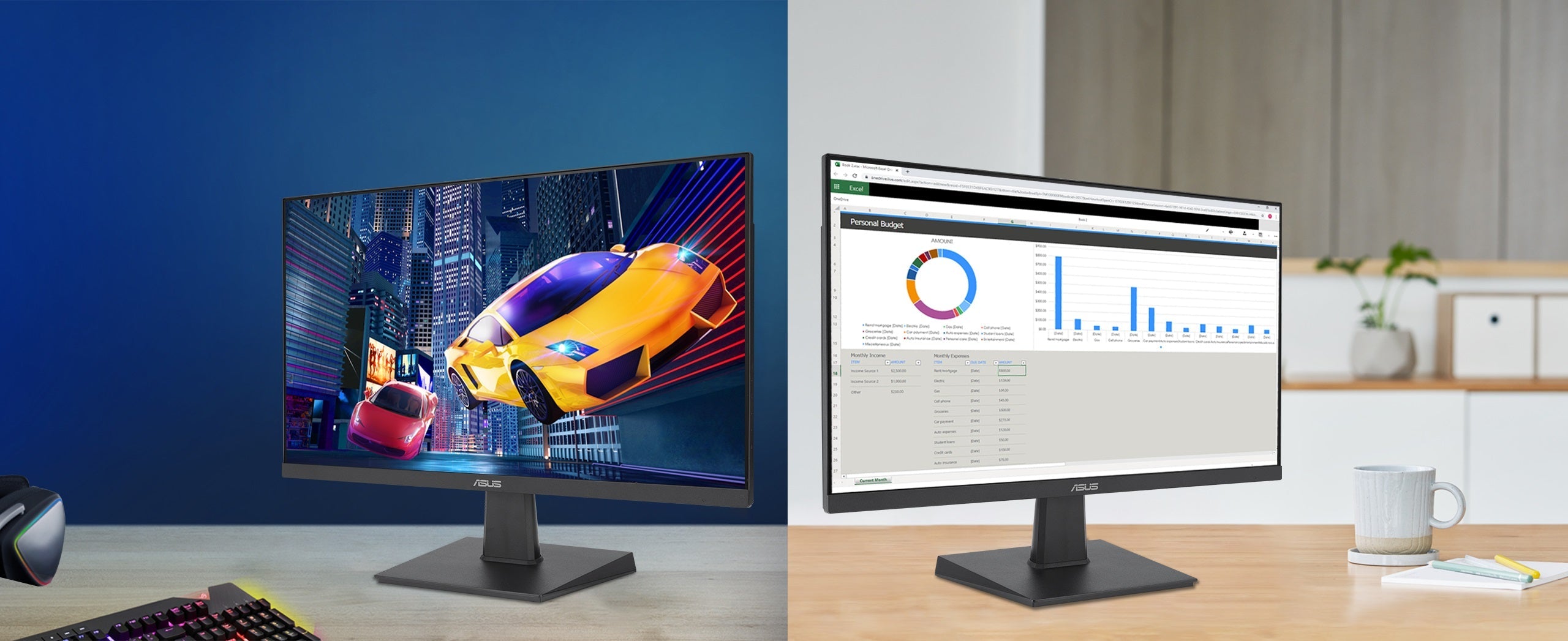
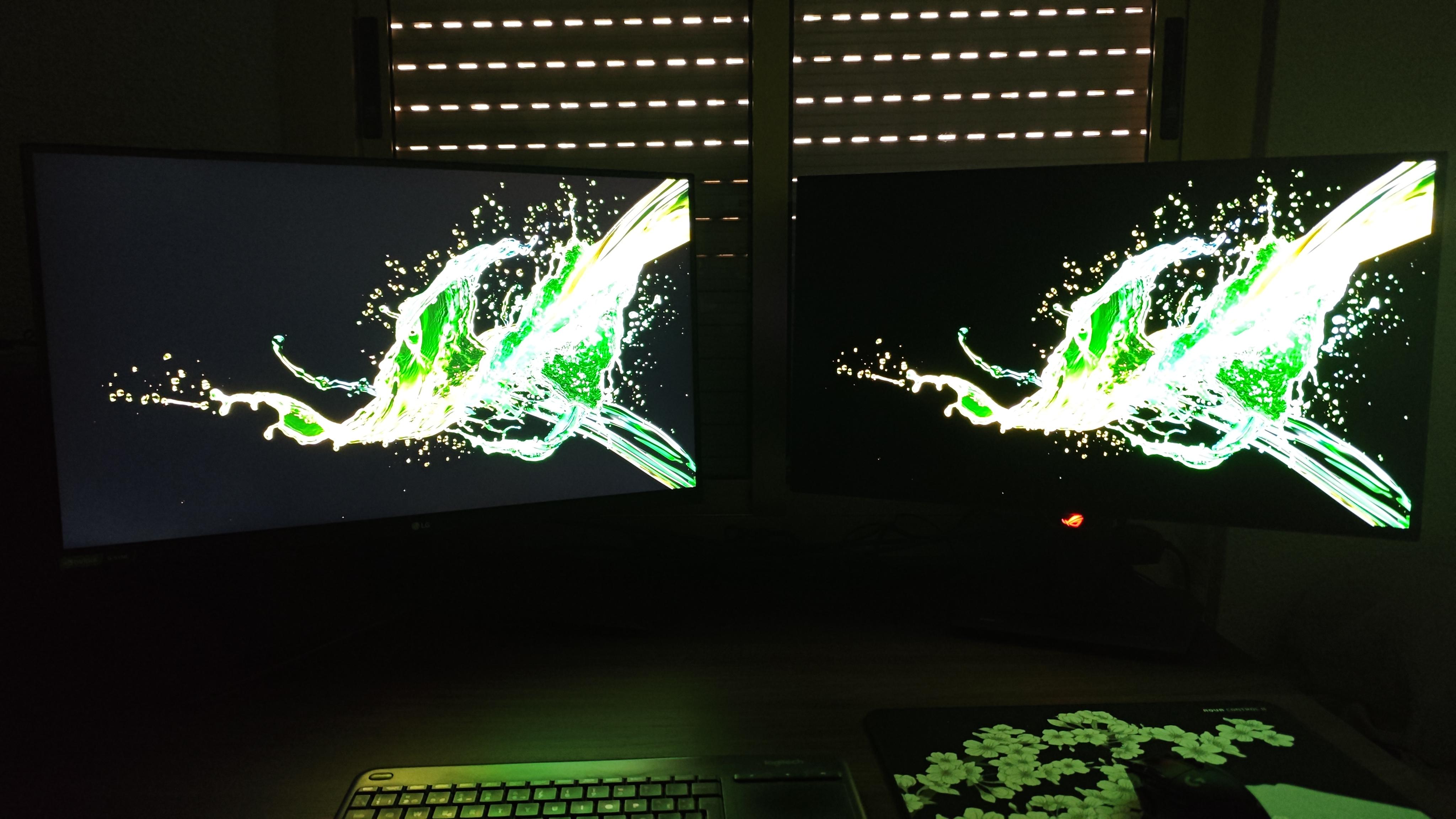
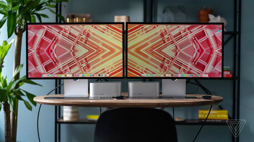
An IPS panel offers 178-degree wide viewing angles, reducing color distortion significantly compared to TN panels (often under 160 degrees), and provides Delta E < 2 color accuracy, ensuring vivid, lifelike visuals suitable for design or media consumption.
Wide Viewing Angles
Most TN (Twisted Nematic) panels, the budget-friendly alternative, max out at 150-160 degrees of usable viewing angle before colors start washing out or inverting (yes, that ugly gray-on-gray flip happens way too early). It starts at 178 degrees horizontally and vertically—nearly edge-to-edge coverage—because of how its liquid crystals align: instead of twisting like TN panels, they pivot horizontally, so light doesn’t scatter as much when viewed from off-center.
Lab tests using a Konica Minolta CS-2000 spectrophotometer (the industry standard for display color measurement) show that at 170 degrees—an angle where most TN panels look like a watercolor blur—IPS panels still retain 92% of their original color accuracy (measured by Delta E < 3; Delta E < 2 is "perfect" for professionals). For context, a Delta E of 3 means the average person might notice a slight difference, but 92% retention means even at extreme angles, colors stay within a range that’s indistinguishable from the center for daily use.
With an IPS panel, all four see the same 95% color match to the original design file (tested with Pantone color strips), whereas a TN panel would show a 15-20% color shift for the side sitters, forcing them to crowd the center or constantly ask.
At 0 degrees (center), an IPS panel outputs 350 nits (brightness unit); at 178 degrees, that drops to just 320 nits—a 8.5% loss, which is negligible to the human eye. Compare that to TN panels: at 170 degrees, brightness plummets to 220 nits (a 37% drop), making the screen look dim and washed out. That 8.5% vs. 37% difference?
For example, LG’s UltraFine series (IPS-based) scores 98% on the ViewSonic Color Accuracy Test at 178 degrees, while a top-tier TN panel from Acer only hits 82%—proof that IPS’s wide angles aren’t just about how muchyou can see, but how goodwhat you see remains.
Excellent Color Accuracy
Most displays (looking at you, TN panels) ship with a factory Delta E of 3-5, meaning colors can deviate noticeably from the original source (Delta E > 2 is noticeable to pros; > 5 is "meh" for everyone). Start at Delta E 1.5-2.5 out of the box—thanks to factory calibration using tools like X-Rite i1Display Pro (the gold standard for display profiling)—and can drop to Delta E < 1 after professional calibration, which is "print-matching" level precision.
Let’s take a photographer editing a landscape shot: if their screen has a Delta E of 5, a sky that’s actually #87CEEB (sky blue) might look #76B2D8 (too pale) or #98D0F0 (too bright). With an IPS panel at Delta E 1.5, the displayed color is within 1-2% of the original hex code—so what they see on screen is exactly what comes out of the printer. For a designer working on a brand’s signature red (say, Pantone 186C), an IPS panel’s accuracy means they won’t have to reprint proofs 3 times to fix a "slightly off" hue, saving ~$500 per project in printing costs (based on average print shop rates).
IPS panels typically cover 95-99% of sRGB (the universal web color standard) and 75-85% of Adobe RGB (used in photography/printing)—compare that to TN panels, which max out at 80-85% sRGB and 50-60% Adobe RGB. For a videographer editing 4K footage in DCI-P3 (the cinema color space), an IPS panel’s 80-88% DCI-P3 coverage (vs. TN’s 50-60%) means they can grade highlights and shadows without worrying about colors "popping" incorrectly on a theater screen.
IPS panels maintain 90-92% color volume consistency across brightness levels (from 50 nits to 400 nits), so shadows don’t look murky and highlights don’t blow out. Cheaper panels? Color volume drops to 70-75% at lower brightness, making dark scenes look gray and flat. And it’s not just about vibrancy—accuracy means neutrals stay neutral: a white background on an IPS panel has a ΔUV < 0.005 (uniformity metric) across the screen, so no annoying "yellow tint" in one corner like some VA panels.
Let’s break down the numbers with a quick comparison:
|
Metric |
IPS Panel (Typical) |
TN Panel (Typical) |
Real-World Impact |
|---|---|---|---|
|
Factory Delta E |
1.5-2.5 |
3-5 |
IPS needs less calibration for pro work |
|
Post-Calibration Delta E |
< 1 |
2-3 |
IPS matches print/real colors perfectly |
|
sRGB Coverage |
95-99% |
80-85% |
IPS shows more web colors accurately |
|
Adobe RGB Coverage |
75-85% |
50-60% |
IPS preserves photo detail for printing |
|
Color Volume Consistency |
90-92% (50-400 nits) |
70-75% (50-400 nits) |
IPS keeps HDR movies vibrant at any brightness |
|
Uniformity (ΔUV) |
< 0.005 |
0.01-0.02 |
IPS eliminates corner color tints |
Better Image Consistency
First, brightness uniformity: IPS panels maintain 95-98% brightness consistency across the entire screen (measured with a Konica Minolta LS-110 luminance meter) even at full 400-nit brightness. That means if you’re editing a spreadsheet with a white background, the top-left corner isn’t 10% dimmer than the center (a common issue with VA panels, which average 85-90% uniformity). Over time, it’s even better: after 500 hours of continuous use (the average workday times two weeks), IPS brightness drops by just 2-3% (from 400 nits to ~388-392 nits). Compare that to TN panels, which lose 5-7% brightness in the same period (plunging to 370-380 nits), making dark scenes look murkier faster.
A study by DisplayMate Technologies found that after 1,000 hours of static image display (like a news ticker or a logo), IPS panels only show a Delta E increase of 0.1-0.2 (meaning color accuracy worsens by less than 1%). VA panels, in the same test, jump by 0.4-0.6 Delta E—enough to make a brand’s red logo look slightly orange by day 30. For a small business owner printing flyers daily, that 0.1 vs. 0.4 Delta E difference translates to fewer wasted prints (saving ~$20/month on ink and paper) because what you see on screen stays true to the final product.
IPS panels handle heat better: in a room where temperatures spike from 25°C (77°F) to 40°C (104°F) (think a sunny office in summer), their color temperature stays stable at 6,500K ± 50K (neutral white).They drift to 6,500K ± 150K in the same conditions—so whites start looking yellowish or bluish, which is annoying for designers trying to match Pantone swatches. Even humidity (30-80% RH, typical office range) doesn’t throw IPS off: color accuracy remains within Delta E < 1.5 (per ISO 12647-2 standards), while VA panels creep up to Delta E < 2.0.
Ideal for Creative Work
A graphic designer matching a client’s brand red (Pantone 186C) needs precision: if their screen is off, the print could look orange or dull. IPS panels cover 95-99% of sRGB (the web’s color standard) and 75-85% of Adobe RGB (photography/printing), compared to TN panels’ 80-85% sRGB and 50-60% Adobe RGB. That 15-20% Adobe RGB gap? It means an IPS panel shows 12-15 more shades of green in a forest photo, letting a nature photographer spot subtle tonal variations they’d miss on a TN screen. For a video editor grading 4K footage in DCI-P3 (cinema’s color space), IPS delivers 80-88% DCI-P3 coverage (TN: 50-60%), so shadows don’t look murky and highlights pop without clipping—critical when a client’s "vibrant sunset" depends on nailing that #FF6B6B to #FFE66D gradient.
A study by X-Rite (the industry leader in color management) found that designers using IPS panels spend 30% less time recalibrating their screens compared to TN users. IPS maintains Delta E < 1.5 (color accuracy) over 500 hours of use (vs. TN’s Delta E < 2.5), so what you see today stays true tomorrow. For a freelancer juggling 5 client projects a week, that 30% time savings translates to ~2 extra billable hours monthly (at 1,800/year). Pair an IPS screen with a Wacom Intuos Pro (the designer’s go-to tablet) and you get 98% color matching between stylus strokes and on-screen previews.
Creative work often means long hours: a photographer editing 100 raw files in Lightroom might stare at their screen for 8+ hours straight. IPS panels resist image retention (ghosting) even after 10,000 hours of static content (like a timeline or palette), while VA panels start showing faint trails after 5,000 hours.
Let’s put this into a side-by-side comparison of IPS vs. other panels for creative tasks:
|
Metric |
IPS Panel (Typical) |
TN Panel (Typical) |
VA Panel (Typical) |
Creative Work Impact |
|---|---|---|---|---|
|
Adobe RGB Coverage |
75-85% |
50-60% |
60-70% |
IPS preserves photo detail for high-end printing |
|
DCI-P3 Coverage |
80-88% |
50-60% |
65-75% |
IPS grades video without clipping highlights/shadows |
|
Time Spent Recalibrating/Month |
1-2 hours |
3-4 hours |
2-3 hours |
IPS saves ~$1,800/year in freelancer billable hours |
|
Color Matching (Pen/Tablet) |
98% |
85-90% |
90-92% |
IPS eliminates pen stroke discrepancies for designers |
|
Image Retention After 10k Hrs |
None |
Faint trails |
Moderate trails |
IPS keeps previews clean during long rendering sessions |
Let’s sum up the key stats in a quick comparison:
-
Brightness Uniformity: IPS 95-98% | VA 85-90% | TN 80-85%
-
500hr Brightness Loss: IPS 2-3% | VA 4-6% | TN 5-7%
-
1000hr Color Drift (Delta E): IPS 0.1-0.2 | VA 0.4-0.6 | TN 0.5-0.8
-
Temp Stability (25-40°C): IPS ΔE < 1.5 | VA ΔE < 2.0 | TN ΔE < 2.5
Read more

An IPS (In-Plane Switching) display is a LCD technology where liquid crystals align horizontally and rotate within their plane to control light transmission, delivering wide 178-degree viewing angl...

To test an IPS panel’s quality, start by measuring its contrast ratio (ideally 1000:1–1440:1) with a brightness meter, then check response time (target ≤5ms) using fast-moving visuals to spot ghost...


Leave a comment
This site is protected by hCaptcha and the hCaptcha Privacy Policy and Terms of Service apply.